Selling on Etsy: Product Photography is Key
This post on improving your product photography is part of a series of Etsy 101 posts. Click here to see the first post in the series.
All of us who’ve spent any time at all blogging or running an Etsy shop have heard countless times that good our product photography is key. We live in a Pinterest world – people are used to bright, beautiful images. If you don’t have good photos, even the greatest items aren’t going to sell. That’s just the way it is.

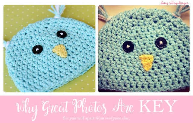
Seeing these two photos side by side really helped me to see just how key good pictures of Etsy items is. The photo on the left is taken with my “grown up” camera – a Canon 60D with a 50 mm lens. The photo on the right is taken with my iPhone. But, you know what, the device isn’t what makes or breaks a photo. Here’s what’s key in product photography.
- Photos are the first thing that will draw a buyer into a shop. If a dark, dreary photo is sitting next to a bright, fun photo, chances are people aren’t going to click yours. Plus, great photos are memorable. Someone might not be ready to buy, but they might remember the cute photos in your shop and come back looking for more.
- Good photos get pinned. Look at the comparison above again. People might want to make something similar. Party planners might want to pin it to a specific board. If you don’t have great photos, this isn’t going to happen. Pinterest is a big traffic driver so try to have Pin worthy images.
- Beautiful product photography will help you get featured. Good item pictures are more likely to be featured in treasuries, on blogs, or other places on the web. When I’m looking for products to showcase, I look for the most clear and beautiful photos I can find.
- Pretty photos convince people to give your product a try. What if people are trying to make a choice between two owl hats? Two coffee mugs? Two dog sweaters? Try to make your photos as good as they can be… it might just be what gets you the sale over “the other guy.” (But really, there are more than enough sales to go around)
- Pictures can bring a cohesive feel to your shop. When you look at a beautiful Etsy shop, chances are, it’s pictures all look uniform. Sure, they might use different angles or different backdrops; but typically, something about their product photography will give the shop a unified feel.
- If you sell digital items, mockups are ok. You don’t need to print out every digital print, invitation, or notecard. You can use cute mockups from great Etsy shops for a cute, styled look. Or, you can just use a plain, neutral background and float the items on top of it.
I’ll leave you with a few examples of what I think works well for photography and why it works. I tried hard to find shops that do their own photograph or images.
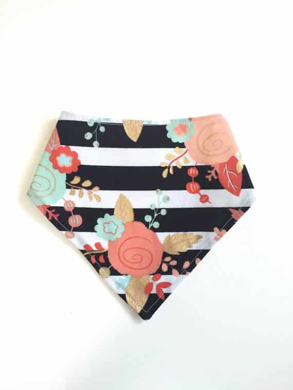
I’m a lover of bright items on a plain white background. That said, if you can’t rock it, don’t even try it. Simplistic Stitches knocks it out of the park with this photo.
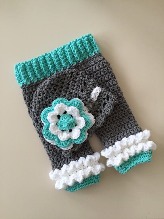
I think this shot from MRocheCrochet does a great job highlighting the details of the crocheted outfit. While it’s not the brightest background, it works well for her item. I like how she shoes the hat and the pants in the same picture.
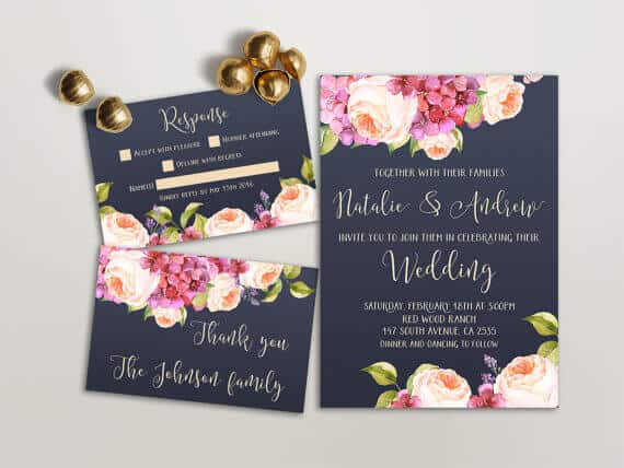
This bridal invitation from Lipa Mea works really well. It highlights the beauty of the invitations in a simple way, but also adds a little extra something with the bells (I’m guessing wedding bells are the reason for these). It also gives some scale to the image.
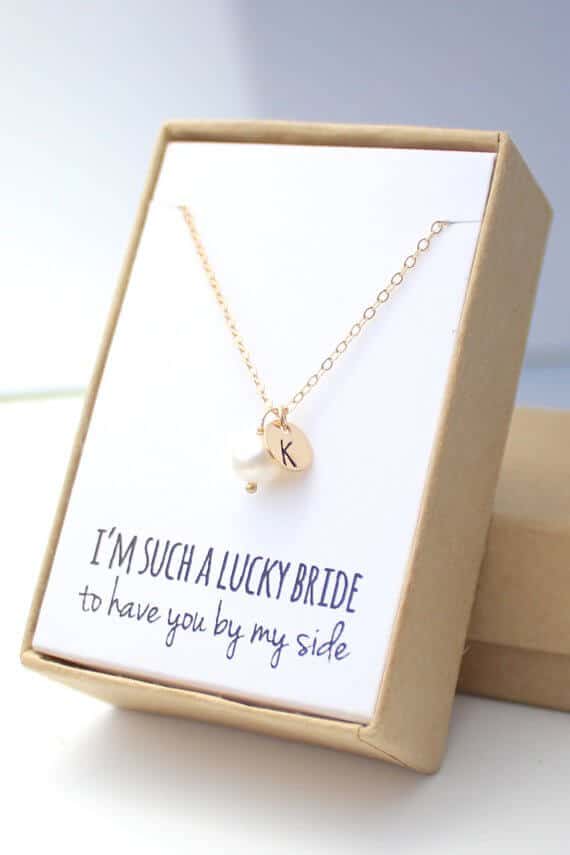
If you use beautiful packaging, it’s a great idea to show that in your photos. This photo from For the Maids is a great sample. The packaging sets her items apart from many others so she’s very smart to draw attention to that with her photos.

